I found another great example of wallpaper-as-art and wanted to share it, especially because there’s an extra bit of food-for-thought here. First, here’s the inspiration photo:

Wallpaper as Art – Inspiration from Style-Files.com
Now there’s a point to all this. First off, this is (part of) a great-looking room (and Style Files is full of inspiration, truly, go look around!) But even more – here’s the bear-with-me idea.
I happen to think this is a great looking vignette. I also think that the wallpaper they’ve used in this pic is totally unremarkable – in and of itself. It’s okay. It’s not fabulous. But the way they’ve used it, as a strong graphic statement, framed AS ART, really does look terrific.
Okay, that’s Idea Number One. It doesn’t have to be priceless art. It has to say something to you, or be a color you love, or whatever. Treat it as art, be bold with it – and it IS art.
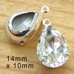
Which leads me to my second point. I took the photo from Style Files and fiddled with it – excuse me ladies, it was just to try something out. What I did, was grab what I consider a totally inappropriate graphic from my own files (inappropriate meaning, it ain’t “art”, it’s just a graphic). This particular graphic is of a pair of earrings on my site – and yes, I do think the earrings are terrific (you can find them here). But as wall art? No, I wouldn’t choose this graphic.
But in my doctored-up-photo, I took the earrings image. I copied it a bunch of times – just like you could do if you took any image you liked and made 20 copies at your local copy shop. Then group the images together on the wall (put pasteboard or something behind them if you don’t want to paste directly on the wall) and presto: you’ve got strong wall art.

See what I mean? This isn’t priceless art. But because it is a strong image, and the repetitive idea makes it even more graphically interesting, and because it’s framed on the wall like “real art” – it works. It looks good. It makes a statement.
It costs practically nothing if you use images from magazine pages. Or maps. Or wallpaper samples. Whatever. Use *recycled* images, that’s even better.
Try it. It works.

